Logo


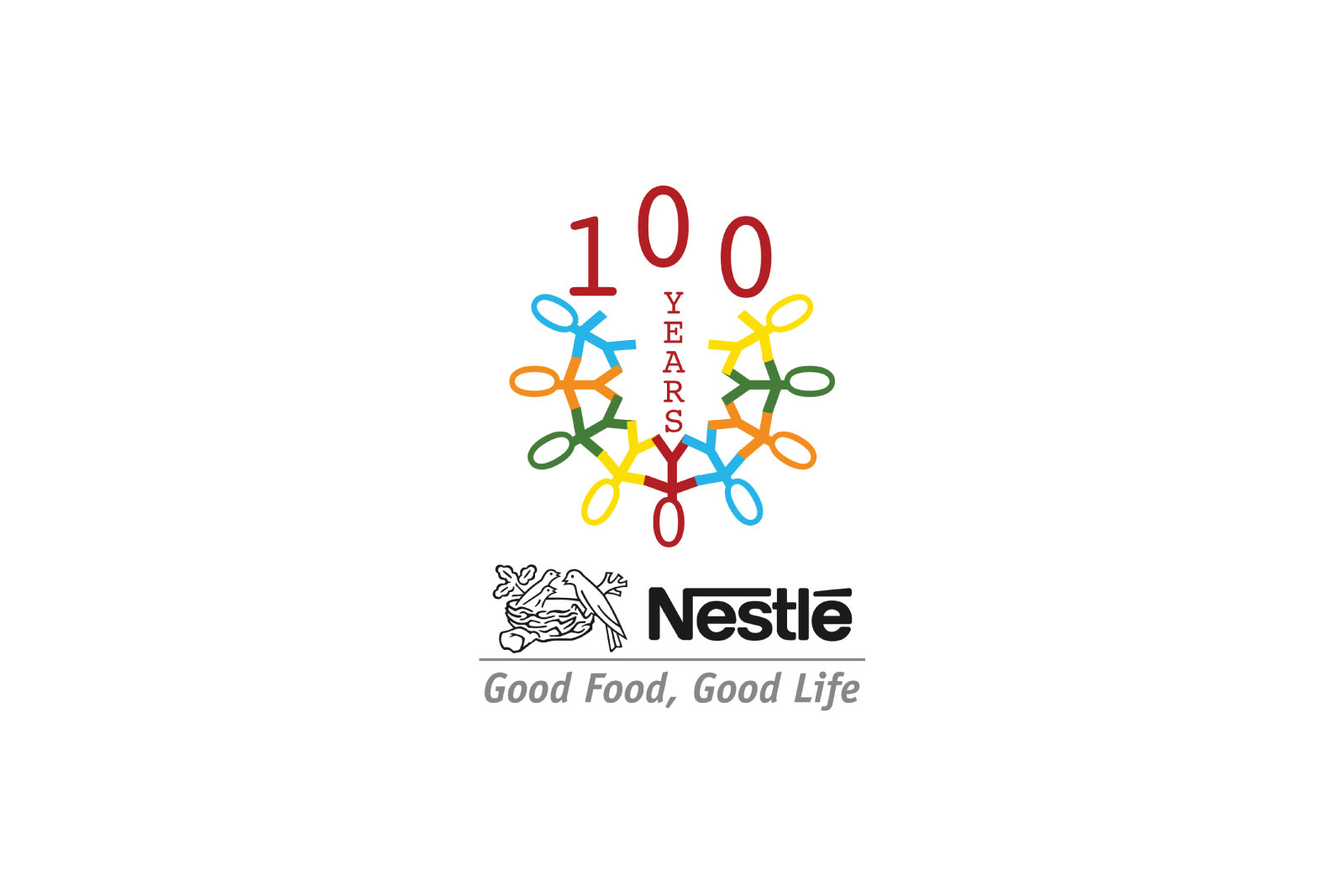
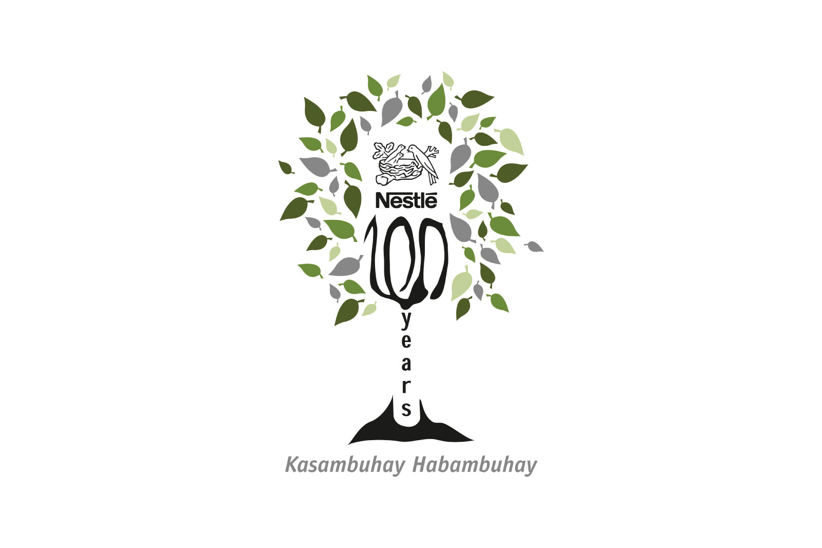
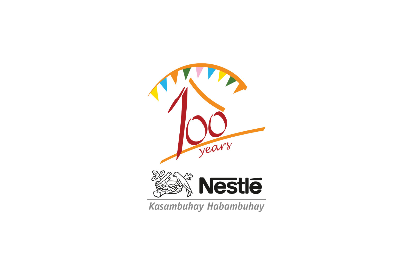
These are logo studies to be incorporated to all product materials and promo collateral for the period of the 100th year celebration of Nestlé Philippines.
The first study emphasizes on the theme ‘togetherness of the community’. A graphical representation of a ‘person’ is multiplied and conjoined in a circular shape to symbolize this theme. Three colors were used and subdued in congruent with the brand color scheme of that year. The ‘100’ and the word ‘years’ placed prominently in red bold color.
The second logo study symbolizes the tagline of the brand ‘Good Food, Good Life’ as the tree symbolizes life itself and food being the fruit it bears. The logo has a two-tone color scheme of black and shades of green with the number ‘100’ and the word ‘years’ incorporated as the trunk and branches of the tree.
The last study has the number ‘100’ and the word ‘years’ formed into a house-like figure – a traditional ‘bahay-kubo’ (nipa hut) to represent all the homes that the brand caters to. To make it more local, a graphic representation of a bunting was also incorporated to represent the traditional Filipino fiestas. Color scheme used are also from the brand chosen scheme for that year.
Project information
Branding, Logo Icon
Nestlé
Art Direction, Graphic Design
Nestlé
explorer of art & creativity
Browse
All images and other content on this website are the intellectual property of MALAYA and are protected by copyright law. Unauthorized downloading, copying, reproduction, modification, or distribution of these images, in whole or in part, for any purpose, is strictly prohibited and constitutes copyright infringement. Any infringement may result in legal action, including claims for monetary damages, injunctive relief, and recovery of attorney’s fees.
